

10 Weeks
Sung-Duk Kang, Alison Chu, Austin Meyers
Treedom is a mobile application concept designed to provide users quick access to information about proper waste disposal and insights on their environmental footprint from recycling and composting. This was a class project for an introductory User-Centered Design course.
Lead Visual Designer. Also contributed to the rest of the design process, as user researcher, prototyper, interaction designer and UX designer.
People often don't know or practice proper waste management (i.e. composting and recycling)
The project began with the very broad prompt of, “create a solution for an everyday problem people face.” After a brief brainstorming session, my team and I landed on the theme of sustainability, specifically issues regarding incorrect waste management. From there, we formulated our initial design question which was:
“How can we help people practice proper waste management?”
The first phase of our design process was to conduct user research on what people’s waste disposal habits were and their general knowledge of waste management. We first conducted secondary online research to identify some of the most common pain points people had when disposing their trash, recycling and other waste.
Each team member then conducted three semi-structured interviews with University of Washington students. These interviews were meant to evaluate and provide depth for some of our initial findings and to identify news ones. From these interviews, we identified three important themes. These were:
We organized our findings from the user interviews and secondary research into affinity diagrams which were used to help develop personas. It was during this stage that we decided that our solution would take the form of a mobile application since the large majority of our target demographic, college students, used smartphones. Furthermore, our participants most commonly ran into the issue of incorrectly sorting their waste while they were on the go.


Our final research method was to conduct a competitive analysis of several existing apps and web services that
aimed to provide users with proper waste disposal information. This was meant to identify potential features and best practices that we could incorporate in our own solution.
We created two personas to encapsulate the common pain points, goals, and desires that were synthesized from our research findings. These personas were meant to model the target users of our app. This allowed us to develop empathy for our users and narrow down our solution to best fit their needs. Our personas, Seth Bryers and Lindsey Parker, provide a narrative of some of the everyday conditions that our users face when sorting their waste and some of the struggles they have doing so. They also highlight some of the common behavior patterns we found from our user interviews. We also constructed different use case scenarios of how our personas might engage with our app based on their pain points, desires and goals.


The next step was to produce rough sketches of our app. Each team member first drafted their own set of designs individually. Then as a group, we reflected on our designs and refined the most promising ones. These sketches were used to lay out the initial visual design and basic functionality of our app.

With our refined sketches completed, we began contextualizing our designs. Following a human centered design approach, we created three brief storyboards to visually convey the user experience of our design ideas. Our storyboards relied on the personas created previously in the design process as well as our design sketches.


The stories we created also helped us refine our designs to improve the experience for our users. This also enabled us to lay out the core functionality in the form of a sitemap, in conjunction with preparing the UX for an initial prototype.

Building from our sitemap and sketches, we began to further refine our ideas by creating a paper prototype of our app. The sitemap provided the framework for the data elements and functions of the application, while the sketches provided direction for the layout and design. Taking various input from the rest the team, I oversaw the creation of our prototype using Balsamiq. The paper prototype enabled us to test the features of our application and its intuitiveness. Presented as a work in progress rather than a finalized concept, we could be flexible with changes and not be hard pressed on specific details or functions. We used to the paper prototype to conduct user testing sessions with our classmates and other students. Each team member took turns being the test conductor and notetaker. We used the results from these tests along with user feedback to evaluate design of our application.


Using the results and feedback we got from our user testing, we refined some of the visual layout and functionality of our paper prototype to produce a set of wireframes. During this phase, I was in charge of fixing the visual aspects of our design, particularly in terms of the icons we used since several users were confused by some of their meanings during our testing.
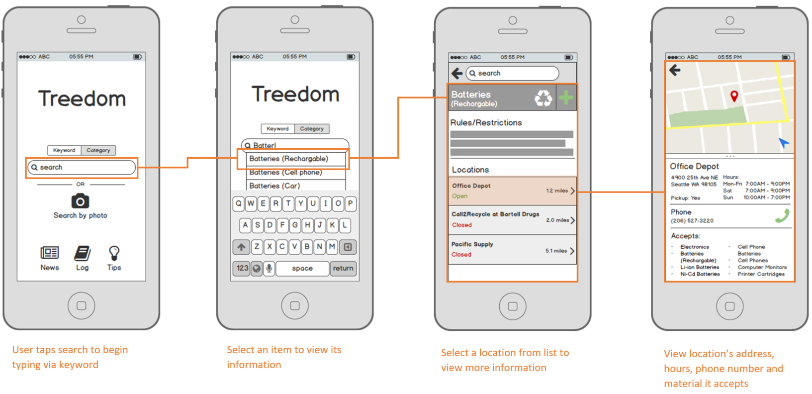
The creation of wireframes was followed by round of peer critiques by fellow classmates. Additional refinements were made to our designs and the final result was a series of high-fidelity mockups of our app.


